We have been testing the 300×600 large skyscraper Adsense Ads which were released by Google Adsense months back. As the extra large ads are getting more popular as it attracts big advertisers – has it emerged as a popular way to make more money with CPC ads?
When you place a large skyscraper ad, you expect a large number of text ads or a large image ad. While typically the large skyscraper ads shows 8 text ads with arrows, it is not always the case and is a challenge for web designers as the ad keeps changing size and design elements.
Large skyscraper ad variations
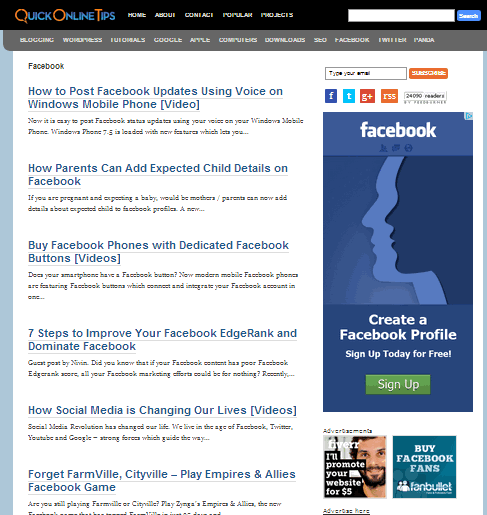
Here is what a common 8 text ads unit and arrows looks like, which has good white space and ad placement.

And here is what it typically looks like with A large rich media image ad – which takes a huge space in your sidebar and that single ad has to be good enough to get clicked.

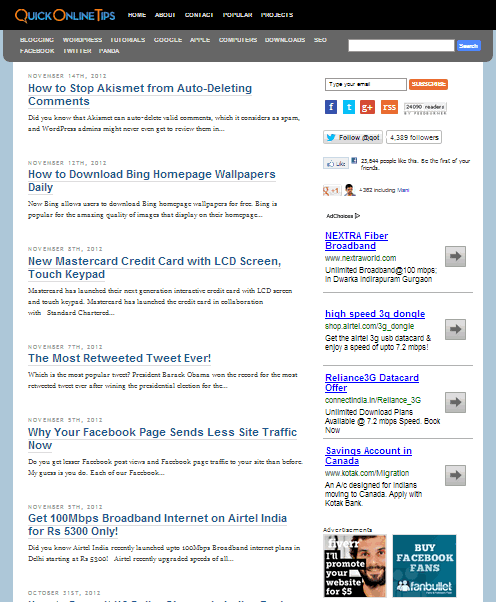
However sometimes they decide to display only 4 text ads with a large whitespace. Do they click better? Maybe they are testing it.

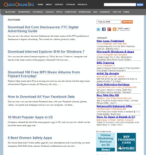
Earlier we also got many ads without the arrows to get a more cluttered look, though now we see more Arrow ads only.

Alternate Tall Skyscraper Ads
Recently we have started noting that when an image ad wins the ad auction, a tall 160×600 tall skyscraper ad starts to display instead of the large 300×600 skyscraper ad. Since most website design elements are modified to fit a large 300×600 ad, a small centrally floating Adsense ad again looks awkward. Maybe they do not have enough large 300×600 image ads competing and have a much larger inventory of 160×600 image ads.

Single text ads
IMO this is the worst variation. The biggest design flaw is when they decide to display a single text ad only which wins the ad auction. While this single large text ad would look good on a medium/large rectangle ad, a single ad filling the entire text space of a large 300×600 skyscraper ad looks awkward. This is especially because the single ad unit gets placed on top of the ad and leaves a large blank space below it, which messes the site design.
The only way to fix this would be to add a colored ad background or an ad border, to show the actual ad size and not be misinterpreted as your site design error. I hope Adsense team fixes this issue soon – and maybe single text ads should not be allowed for this size.

No Image Ads Only Option
I thought I should switch only to image ads to avoid this single text ads issue. But to my surprise, unlike other ad units, they do not have an image ad only option for this ad size. It is probably due to low image ad inventory in this size and disabling this option prevents occurrence of untargeted low paying ads or Public service non paying ads.

Does the 300×600 large skyscraper pay more?– We currently tested this ad on archives/tag/category pages only in the sidebar, which is not a prime placement, so will naturally have lower CTR and has lower page views than if placed in single articles. So this ad earns us much less and has a much lower CTR than the the prime placement in-content large rectangle 336×280 ads on single articles.
I also plan to replace these ads with 300×250 medium rectangle soon as the single top placed text ads and alternate sized ads are not a good user design experience. What are your thoughts on this.