
New Google Adsense Smart Sizing Responsive Ads
Now the new Google Adsense smart sizing responsive ads are truly the best responsive ads designs which the Adsense team has produced. The simple javascript code allows Adsense algorithms to detect the screen size and column width of the page element, and serve ads which best fit the size – no more horizontal scrolling or ugly large ads.
Adsense had released responsive ads few months back which allowed you to specific custom ad sizes based on CSS media queries. But these ads would not change the size, if the users decides to change the orientation of the smartphone from landscape to portrait. Now the new smart units can change size as you rotate the screen!
Then they also introduced a few days back, new smaller 320×100 large mobile banners which looked better on smaller mobile screen sizes. In fact this size looked and fitted so well that we switched to this as our primary ad unit.
Premium Adsense Options to All
When they started asking premium Adsense publishers to change scripts, a major change was underway. These select publishers had powerful options to choose their own font sizes, font types, and any ad sizes they liked to fit their site design – and now these options were gone. They too will use the new responsive code.
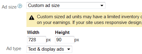
In fact if you see you can choose custom Adsense ad sizes, but then these will have limited rich media / images inventory and will earn less. See the new custom ad options
Smart Sizing Responsive Ads
Now these responsive ads can detect the screen size and based on your CSS column width – decide which ad to serve which will earn you the most income per click. Note that Adsense became smart in serving smaller higher paying ad units if available, which made larger ad units better for more online Adsense earnings.
This not only introduces more ad competition, but also makes it easier for most site owners who find it difficult to edit Adsense code to decide media queries (its not so simple for most webmasters).
When you create a new ad unit, choose ad size as Responsive Ad Unit. Choose the smart sizing ad option when you select the code.

See the code is much simpler now, with nothing to edit.
<script async src="//pagead2.googlesyndication.com/pagead/js/adsbygoogle.js"></script>
<!-- Responsive A -->
<ins class="adsbygoogle"
style="display:block"
data-ad-client="ca-pub-1234567"
data-ad-slot="1234567"
data-ad-format="auto"></ins>
<script>
(adsbygoogle = window.adsbygoogle || []).push({});
</script>
Note that if you use multiple ad units on the same page, you only need to use the adsbygoogle.js only once. However, the ins code does bring a yellow border around the resizing ads in default WordPress 2013, 2014 theme and here is how to remove yellow border around these ads.
New Adsense Sizes
In fact to make the responsive ads truly work across a range of web design sizes, they will need more ad unit size options. So they introduced now ad sizes too – 700×100 px, 400×200 px and 160×240 px. I don’t see these sizes yet in my options, but then you can choose any custom size and make these ads.

As I see it, eventually Google will make this responsive code the default setting across its network. if you still do not have a responsive web design for your site, you must get one – as this is no longer an optional feature of modern web design.
Use this truly responsive code and earn more money.