
Google Mobile-Friendly Test Is Gone: How to Test Your Site in 2026
Looking for the Google Mobile-Friendly Test? Google retired the tool, along with its API and the Mobile Usability report in Search Console, on December 1, 2023. In 2014 we ran QuickOnlineTips through it and proudly shared that our Bootstrap-based responsive design passed. The goal is the same today: your site must work well on phones. Here is what the tool did, why it went away, and how to test mobile-friendliness now.

Quick answer: Google’s Mobile-Friendly Test was retired on December 1, 2023. To test a site today, run Lighthouse in Chrome DevTools or PageSpeed Insights for mobile performance and best-practice checks, use Chrome’s device toolbar to preview different screen sizes, open the page on a real phone, and use Search Console’s URL Inspection tool to see how Googlebot Smartphone renders it. Check that text is readable without zooming, buttons are easy to tap and there is no sideways scrolling.
Table of Contents
What the Google Mobile-Friendly Test was
Launched in 2014, the free tool let you enter a URL and get a simple pass or fail: “Page is mobile-friendly” or a list of problems such as text too small, clickable elements too close together or content wider than the screen. It became especially important around Google’s 2015 mobile ranking update, when site owners rushed to make sure their pages passed.
Why Google retired it
When Google dropped the tool in December 2023 (external site), it pointed to Lighthouse and other mature resources for evaluating mobile usability. By then, Google had also moved to mobile-first indexing, which means it primarily uses the mobile version of your pages for indexing and ranking.
How to test mobile-friendliness in 2026
1. Lighthouse in Chrome DevTools
Open your page in Chrome, press F12, choose the Lighthouse tab, select Mobile and run an audit. You get scores for performance, accessibility, best practices and SEO, with specific fixes. See Google’s Lighthouse overview (external site).
2. PageSpeed Insights
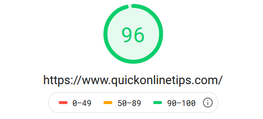
PageSpeed Insights (external site) runs Lighthouse online and adds real-user Core Web Vitals data when your site has enough traffic. Check the Mobile tab first.
3. Search Console URL Inspection
In Google Search Console (external site), inspect a URL and use the live test to see the page as Googlebot Smartphone renders it, including a screenshot and any loading issues.
4. Chrome’s device toolbar
In DevTools, click the device icon to preview your page at common phone and tablet sizes and spot layout problems quickly.
5. Real phones
Nothing beats opening the site on an actual iPhone and Android phone, on mobile data as well as Wi-Fi.
Mobile-friendly checklist
- Responsive design that adapts to every screen width.
- A viewport meta tag:
<meta name="viewport" content="width=device-width, initial-scale=1">. - Body text around 16px, readable without zooming.
- Buttons and links large enough to tap, with space between them.
- No horizontal scrolling; wide tables scroll inside their own box.
- Fast loading: compressed images, lazy loading and caching.
- No intrusive full-screen pop-ups on mobile.
- The same important content on mobile as on desktop.
The evolution of mobile websites
As we wrote in 2014, sites first built separate “m.” subdomains, then some tried .mobi domains, before responsive design became the standard: one site that works on everything from small phones to giant monitors. We moved QuickOnlineTips to a responsive theme early on, built it on Bootstrap, and today run on the Kadence theme. Our 2014 complaint still applies to too many sites: designed for desktop, then left with tiny text, sideways scrolling and broken scripts on phones.
For step-by-step fixes, see how to make your site mobile-friendly for free and our guide to Core Web Vitals.
FAQ
Is the Google Mobile-Friendly Test still available?
No. Google retired the Mobile-Friendly Test tool, its API and the Search Console Mobile Usability report on December 1, 2023.
What replaced the Mobile-Friendly Test?
Google pointed users to Lighthouse. PageSpeed Insights and Search Console’s URL Inspection tool also help you check how pages work on mobile.
Does mobile-friendliness still matter for SEO?
Yes. Google uses mobile-first indexing, so the mobile version of your site is what it mainly crawls and ranks, and mobile visitors leave hard-to-use pages quickly.
How do I know if my site uses a responsive design?
Resize your desktop browser window or use Chrome’s device toolbar. If the layout rearranges to fit narrow screens without sideways scrolling, it is responsive.
Stuck on a gift? Try our free Gift Idea GeneratorIdeas for anyone by age, job, interests and budget, with Amazon.com and Amazon.in linksFind gifts →Get our free weekly email: new tech guides and tools, no spam.
New and updated tech guides, a free tool worth bookmarking and one useful pick, once a week. No spam, unsubscribe anytime.
One email a week. Unsubscribe anytime. See our privacy policy.




Yes my site is Pass the Google Mobile-Friendly Test…..
yeah, its cool article i like it
Yes i have checked my blog score is above 60%
i want to improve score upto 90%
Google Mobile-Friendly Test help me to check my website
My website is mobile friendly. I knew it before, but I tested the page, how do you advise us. I’m glad for that, and you want success in their work. thank you
I hope this will be resolved quickly for the benefit of all of us. I hope the success of the work of everyone.
The google mobile-friendly test very handy tool, so many different ways to view a web page these days its a must to be mobile friendy.
How can bulk SMS service help companies?
For any business to be successful, a good marketing strategy is a must. Bulk SMS advertising is the need of the hour. With this kind of service you can send thousands and millions of messages in a single click without going through hectic schedule of typing it over and over again.
Nice tool. Even though it is buggy, it is still how Google sees your website. I had a few sites that failed this test. Although they were responsive and very mobile friendly, I had a robot.txt blocking Google Bot from a graphic file. It took 1 minute to fix, and so here is me hoping for an surge of website visitors from organic mobile search.
mobile responsive traffic is most important in seo…
thank you for sharing
Thanks for sharing the info. I haven’t checked my site for this Google Mobile Friendly site test.
True, all site needs to be responsive nowadays. I am working on my site to make it mobile friendly.
Thanks for providing such a great info. I thing my website is mobile friendly. but how i confirm it. please suggest me.
My Site Is Mobile Friendly .. But Never Seen Any Advantage Can U Tell Hw .. It Will effect more ? reply and tell me solution.
Thank you for the info! It is important that websites are based on retina & bootstrap as high percentage of people search for information on mobile phones or tablets.
mobile friendly test is essential for every website,and its also a great impact for your search engine ranking.
the Google Mobile-Friendly Test Important Test.
The Google Mobile-Friendly Test Is Very Important Site.
I am still waiting for the day Google includes mobile friendliness as one of the SEO factor in ranking. It appears to me that quite a large number of sites are still not mobile friendly, thus Google is pushing for it but until it hits X %, they will probably not take mobile SEO and responsive theme into consideration.