
How to Delay Loading Non-Critical CSS to Speed Up Your Mobile Site
Every stylesheet in your page’s <head> is render-blocking: the browser won’t show anything until it has downloaded and processed all of them. On a slow mobile connection, that can add seconds before visitors see your content. The fix is to delay loading non-critical CSS, the styles that aren’t needed for the first screen, while keeping the critical styles inline. Here’s how to do it in 2026 with one line of HTML, and with WordPress caching plugins.
Quick answer: Inline the small amount of critical CSS needed for the top of the page in a <style> tag. Load the rest asynchronously with <link rel="stylesheet" href="style.css" media="print" onload="this.media='all'">, plus a <noscript> fallback. On WordPress, plugins like LiteSpeed Cache or WP Rocket can generate critical CSS and load the rest asynchronously for you.
Table of Contents
What is non-critical CSS?
Critical CSS is the minimum CSS needed to display the part of the page visitors see first, above the fold: the header, layout, fonts and the start of the article. Non-critical CSS is everything else: styles for comments, footers, icons, widgets, pop-ups and pages the visitor hasn’t opened.
If you load all of it in the head, the browser has to fetch every file before rendering. PageSpeed Insights flags this as “Eliminate render-blocking resources”:

Fixing it improves First Contentful Paint and Largest Contentful Paint, two metrics behind Core Web Vitals.
How to delay loading non-critical CSS (the modern way)
Step 1: Inline the critical CSS
Put the styles needed for the first screen directly in the head:
<style>
  /* critical CSS: layout, header, fonts, first content */
  body { margin: 0; font-family: system-ui, sans-serif; }
  .site-header { ... }
</style>
Keep it small, ideally under about 14 KB, so it arrives with the first network round trip. Tools such as the Critical (external site) npm package can extract critical CSS automatically.
Step 2: Load the rest asynchronously
Change your normal stylesheet link to this:
<link rel="stylesheet" href="/css/style.css" media="print" onload="this.media='all'">
<noscript><link rel="stylesheet" href="/css/style.css"></noscript>
How it works: browsers download stylesheets for media="print" at low priority without blocking rendering. When the file has loaded, the onload handler switches it to all, and the styles apply. The <noscript> line keeps the page styled if JavaScript is off. Google’s web.dev guide to deferring non-critical CSS (external site) explains the technique in detail.
When we first wrote this post in 2015, we used a longer JavaScript snippet from Google that injected the stylesheet with requestAnimationFrame. The one-line media="print" method does the same job and is now the standard approach.
What we moved out of the critical path
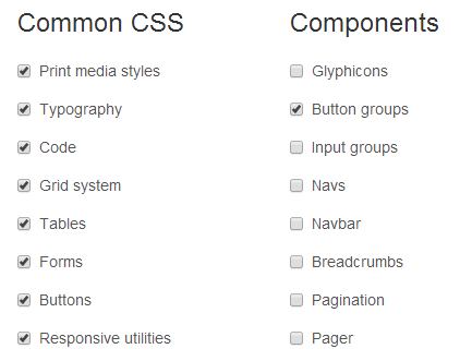
We kept our core layout CSS in the head, because columns and the sidebar must render correctly straight away. Back then that was Bootstrap; today it’s the tiny Chota CSS framework, which is small enough to inline completely. But we load Font Awesome icons asynchronously, because icons can appear a moment later without affecting the layout.
Good candidates to load asynchronously:
- Icon fonts and icon stylesheets
- Comment, share-button and widget styles
- Styles for sliders, lightboxes and pop-ups
- Web fonts (see how to load Google Fonts faster)
Watch out for layout shifts. If a late stylesheet changes the size or position of visible elements, the page will jump, which hurts your Cumulative Layout Shift score. Make sure anything visible on the first screen is styled by the critical CSS.
Delay non-critical CSS in WordPress
You don’t need to edit theme files. Popular caching plugins do it for you:
- LiteSpeed Cache (external site): under Page Optimization > CSS Settings, turn on Load CSS Asynchronously and Generate Critical CSS. This is what we use.
- WP Rocket (external site): turn on Remove Unused CSS or Load CSS asynchronously in File Optimization.
- Autoptimize (external site): has an Inline and Defer CSS option.
Test your pages after enabling these settings, as aggressive CSS optimization can occasionally break layouts. For more ideas, see these ways to load CSS faster.
Frequently asked questions
Is it OK to load all CSS asynchronously?
Not without critical CSS. If no styles load in the head, visitors briefly see an unstyled page (a “flash of unstyled content”). Always inline critical CSS first.
Does deferring CSS help SEO?
Indirectly. Faster rendering improves page experience metrics like LCP, which are part of Google’s ranking signals, and keeps mobile visitors from leaving.
What about rel=”preload”?
<link rel="preload" as="style" onload="this.rel='stylesheet'"> also works, but it downloads at high priority and can compete with more important files. The media="print" method is simpler and safer for non-critical CSS.
Get our free weekly email: new tech guides and tools, no spam.
New and updated tech guides, a free tool worth bookmarking and one useful pick, once a week. No spam, unsubscribe anytime.
One email a week. Unsubscribe anytime. See our privacy policy.



Hi There, while the css thing can be tackled with the help of this usefull article could anyone please let us know if there is any way to minify java without any plugins.. as the plugins are failing on my site to minify java, css thing has just worked fine.. any help will be appreciated..
Hi!
“You can replace the path to CSS with your CSS file and this code before the BODY closing tag at the bottom of your HTML. ”
Which html file do you mean ? I’m using WP.
Thanks a lot for the script. I think, this is the link I’ve been looking for. I was really worried about the next Google algorithm update which is going to focus on mobile optimization. So, yeah it helped a lot.
really nice blog you posted i will accept with this mobile compatibility want to be there for every site because so many users are searching from mobile also .
thanks for sharing this information.
I completely agree that Google mobile usability is getting more and more important. Thanks for this article. Helped a a lot.
Amazing Post. This is too much important to know the developers.
Thanks!
Hi!
“You can replace the path to CSS with your CSS file and this code before the BODY closing tag at the bottom of your HTML. ”
Which html file do you mean ? I’m using WP.
Great article! I’m gonna try this script and see what happens. One question, how does it work with multiple css files?