
How to Turn On ClearType in Windows 11, 10 and XP for Sharper Text
Is text on your screen fuzzy or tiring to read? You can turn on ClearType to make fonts sharper and easier on the eyes. When we wrote this tip in 2005, Windows XP shipped with ClearType switched off and you had to use an online tuner or a PowerToy to enable it. In Windows 11 and 10 it is on by default, but the built-in ClearType Text Tuner still helps when text looks blurry, especially after connecting a new monitor.
Quick answer: In Windows 11 or 10, press the Start button, type Adjust ClearType text and open it. Tick Turn on ClearType, click Next, and pick the sharpest text sample on each of the five screens. Repeat for each monitor if you use more than one.
Table of Contents
What is ClearType?
ClearType is Microsoft’s font smoothing technology. It uses the red, green and blue sub-pixels of an LCD screen to draw letter edges more precisely than ordinary anti-aliasing, so small text looks crisper. It was designed for flat-panel displays and works best on them; old CRT monitors benefited much less.
How to turn on ClearType in Windows 11 and 10
- Click Start and type ClearType.
- Open Adjust ClearType text. You can also press Win+R and run
cttune. - Tick Turn on ClearType and click Next.
- Windows checks that your monitor is at its native resolution. Click Next.
- On each of the five screens, click the text sample that looks clearest to you.
- Click Finish. If you have several monitors, the tuner offers to tune each one.
How to turn on ClearType in Windows XP
If you still run an old XP machine, right-click the desktop, choose Properties, open the Appearance tab and click Effects. Tick “Use the following method to smooth edges of screen fonts” and choose ClearType. Back in 2005 we used Microsoft’s online ClearType Tuner, which only worked in Internet Explorer, and the ClearType Tuner PowerToy for finer control. Both have long been retired.
Still blurry? Other fixes for fuzzy text
- Use native resolution. In Settings, then System, then Display, choose the resolution marked “Recommended”.
- Check scaling. Odd scaling values like 125% can blur some older apps. Right-click the app, choose Properties, then Compatibility, then “Change high DPI settings” and tick “Override high DPI scaling behaviour”.
- Let Windows fix apps. In Display, then Scale, turn on “Let Windows try to fix apps so they’re not blurry”.
- Adjust the monitor. Set its sharpness to the default and use a digital cable (HDMI or DisplayPort), not VGA.
- Set the right refresh rate. Flicker causes eye strain too. See how to change your monitor refresh rate.
Does ClearType affect web browsers?
Partly. Modern browsers such as Chrome and Edge use their own font rendering, though they respect some Windows settings. If text in one browser looks thin, try another font size or zoom level. Readable fonts for coding and reading also make a big difference.
Tips to reduce eye strain
- Follow the 20-20-20 rule: every 20 minutes, look at something 20 feet away for 20 seconds.
- Turn on Night light in Windows display settings in the evening.
- Increase text size in Settings, then Accessibility, then Text size, rather than squinting.
- Match screen brightness to the room so the display is not glaring.
FAQ
Is ClearType on by default in Windows 11?
Yes. Windows 11 and 10 enable ClearType automatically, but running the tuner can still improve clarity on your specific monitor.
Should I turn ClearType off?
Some people with high-resolution or OLED screens see coloured fringes around text. If so, try the tuner first; if fringes remain, turning ClearType off is fine.
Does ClearType work on a Mac?
No. ClearType is a Windows feature. macOS uses its own font smoothing.

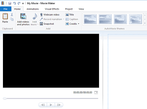



Yeah, most Cleartype doesn’t look as good as the ClearType JPEG (cough, cough), and they cheated by making them italics. Plus, normal text doesn’t give half your readers headaches.
Any equivalent for the mac?