
Got a New Free Professional Logo!
You can check out our new professional logo which live on site right now. The free logo is courtesy of Logo Design Works, who are offering free logo design services to top bloggers

I applied to Logo Design Works for this free logo design and was selected. I was assigned a lead designer, got to review 3 amazing logo design concepts (based on my initial suggestions while applying), selected one and then followed 3 rounds of changes and tweaking for positioning, colors and fonts. Once the logo was finalized, they uploaded the final files formats as .jpg, transparent .gif, .ai and .eps formats.
They have a nice online studio floor where they post these logos, concepts and designs – you can then post your comments , they can respond and clarify your requirements. The entire process is over just over 5 days. This is their Bronze Logo Design Package worth $197 and I got it free of cost! You can also apply now.
I cropped out the dynamic Q form and it now it is useful for branding our feed, and the same logo goes out in our email updates too. I also tweaked the logo and created a favicon using the DynamicDrive Favicon Generator. I am still tweaking it and hope to redesign the wordpress template to blend the logo more.
Older Logos
Here is the earliest logo created by Gotlogos for $25 only


How do you like our new logo? Post your comments.
Stuck on a gift? Try our free Gift Idea GeneratorIdeas for anyone by age, job, interests and budget, with Amazon.com and Amazon.in linksFind gifts →Get our free weekly email: new tech guides and tools, no spam.
New and updated tech guides, a free tool worth bookmarking and one useful pick, once a week. No spam, unsubscribe anytime.
One email a week. Unsubscribe anytime. See our privacy policy.
Logo design Works does awesome work. I am using their free wordpress theme on my blog:)
I think this is a simply amazing logo. Go on…
The new logo really really looks striking. Keep on your good work :-)
Sadly for me, they didn’t accept my request.
@Vincent – The logo is now left aligned. I did a full redesign of the header too.
Its great everyone is liking the logo. :-)
Definitely better thn previous logo!
Woohooo! I was accepted by them and they showed me their first milestone yesterday :D with 3 new concept logos for sizlopedia
Sizlopedia will be getting a new logo by them soon :D
QOT really got a nice one :)
It’s too small? Maybe you can align the logo to the left and use the right space for a banner ad or something, looks odd for a little dude to stand alone in the middle. Just my 2 cents.
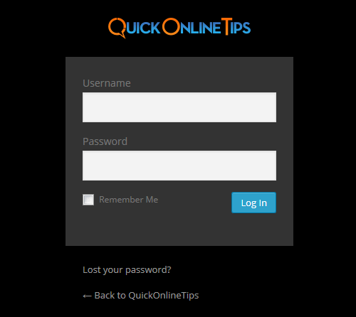
I have posted the older logos and updated logos with both light and dark backgrounds for your reference.
The new favicon is live now.
Wow! This logo looks great. Much better than the old one.
I’m also looking forward to see the little favicon ;) Frankly, I don’t like the current favicon over here. :)
PC, It looks cool. In your post it would be great to see the before and after :-)
But I’d like the logo more (appreciate) after you tweak the theme…
Looks great, I just got my drafts and i really like them, it’s going to be hard to choose from their designs. they do great work, I think I’m going to be using them for some other projects of mine, too.