
320×100 Large Mobile Banner: How to Use This AdSense Size
The 320×100 large mobile banner is one of the most useful AdSense sizes for phones. Google quietly added it in December 2013, and we started using it right away in place of the big rectangle in our responsive ad unit. More than a decade later it’s a standard mobile ad size. Here’s how it works, how to use it in 2026 and when responsive ads are the better choice.
Quick answer: The 320×100 large mobile banner shows a single ad that fits the width of most phone screens without taking over the page. In AdSense, create a display ad unit, choose Fixed size and enter 320 x 100, or let a responsive ad unit pick it automatically on phones. It’s taller than the 320×50 banner, so it usually earns more while staying less intrusive than a 300×250 rectangle.
Table of Contents
Why we liked the 320×100 size
In 2013 we used responsive AdSense units that showed a 336×280 large rectangle on wide screens and a 300×250 rectangle on phones. On mobile, those rectangles took up a lot of space, and by the time they loaded, readers had often scrolled past a big blank box. The 320×100 banner filled the phone’s width neatly, with less disruption. We saw mostly text ads in it at first, since few advertisers had made images for the new size.
How to use the 320×100 ad size
- In AdSense, go to Ads > By ad unit > Display ads.
- Name the unit and switch the size from Responsive to Fixed.
- Enter 320 width and 100 height, then create the unit and copy the code.
- Show it only on mobile using your theme’s mobile ad slot or CSS media queries, so desktop visitors see a larger unit.
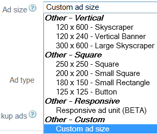
Any AdSense publisher can create custom AdSense ad sizes like this within Google’s size limits.
320×100 vs other mobile ad sizes
- 320×50 mobile banner: smaller, less intrusive, usually lower earnings.
- 320×100 large mobile banner: a good balance of visibility and user experience.
- 300×250 medium rectangle: lots of advertiser demand but takes more screen space.
- Responsive and Auto ads: Google picks the size for each screen automatically.
Fixed 320×100 or responsive?
For most sites, responsive AdSense ads are easier and adapt to every screen, including very narrow phones where a fixed 320-pixel ad can overflow. Use a fixed 320×100 only when you need it in a specific mobile slot, and test both in your AdSense reports.
FAQ
Is 320×100 a standard AdSense size?
Yes, it’s a recognised large mobile banner size with good advertiser demand.
Where should I place a 320×100 ad?
Near the top of the content or between paragraphs on mobile, without pushing content too far down.
Does the 320×100 ad work on desktop?
It can, but it looks small. Show larger or responsive ads on desktop instead.



think this 320×100 ad size is super and much better than the earlier attempt at mobile ad sizes. The text fills very well and I expect a good CTR, though I did not see any image ads competing for this ad
Really good news for all of Google adsense publisher like me.Thanks sarvha satya for sharing with us.
Hi,
I hope, certainly this additional feature gives comfortness for the mobile ads.
Thanks for sharing it.
Well google is fair enough to everyone and they are giving excellent ways to make money online
I can’t see this option in my adsense dashboard….:(
Hi,
I have tried Google Ads multiple time and hardly saw any significant value add, however this large mobile banner add might be useful if not annoying for the user.
Thanks for sharing
Rajeev
Yes, surely this size looks quite comfortable for the mobile ads. This will reduce the scrolling and complexity of the process involved.